Developer Fonts
Some history.
If you are anything like me, this will simply look so wrong it will make you angry !. It might be the light-mode view, it might be the lack of well defined colours in the syntax highlighting, it might be the fact the language is rust. However if you are me, the most obvious problem is the font isn’t mono-spaced.
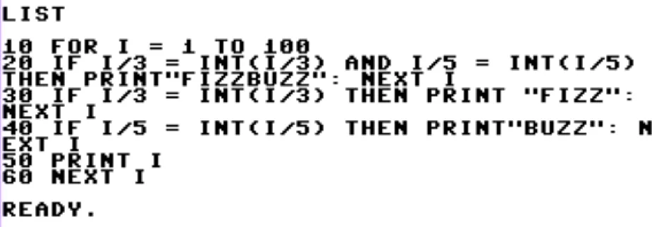
I’ve spent over 30 years looking at code, and for almost all of that time, the rules have been simple. The screen is made up of a grid of characters, and on each grid element a single character can be displayed. Fonts like Times New Roman, used in the above example, are variable width fonts. They don’t stick to the grid. Sequences of characters that fit neatly together like iiiiii take up less space that wider characters like wwwwww. Here is fizzbuzz as I would have seen it on my first computer.
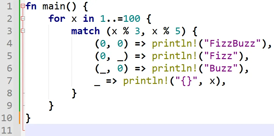
Going back to a more modern programming language with a more editor, things instantly look much better if we switch to a monospaced font, like Consolas.
Ligatures
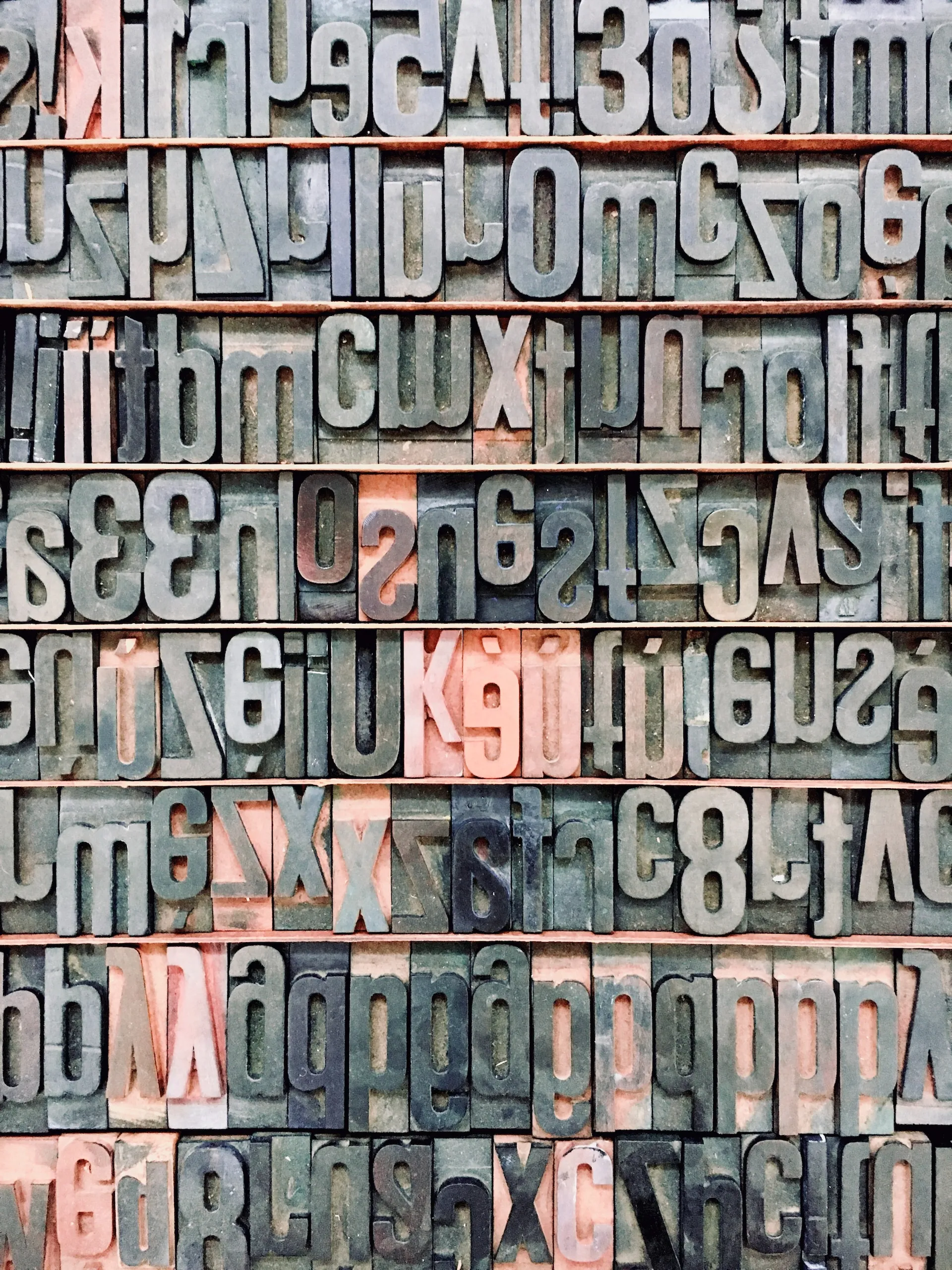
There are many modern fonts that offer all the same things as Consolas, or Courier, or any other monospaced font would. They also offer ligatures. Ligatures are historically interesting, but come from typography. They are purely about the typesetting. For example, ꝏ is simply a typographic ligature for oo use in some historical typesetting environments, most famously some of the earliest US published bibles.
Where as ß is a seperate letter in the german language. It isn’t some modified B, it is a letter of its own.
There are even some confusing cases. Old English used to have a letter Æ but modern English no longer does. Danish and some other languages however do.
Coder Fonts.
Modern “coder” fonts take advantage of this idea of ligatures by taking common multicharacter code elements and replacing them with a single “character” that takes up a single grid entry. It does this automatically as you type.
The font I prefer is Fira Code. You can view the documentation for the font to see how different characters will be rendered as ligatures using the font.
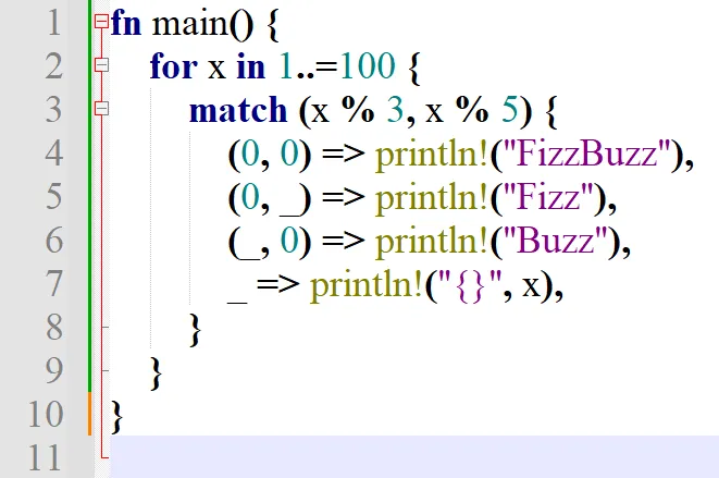
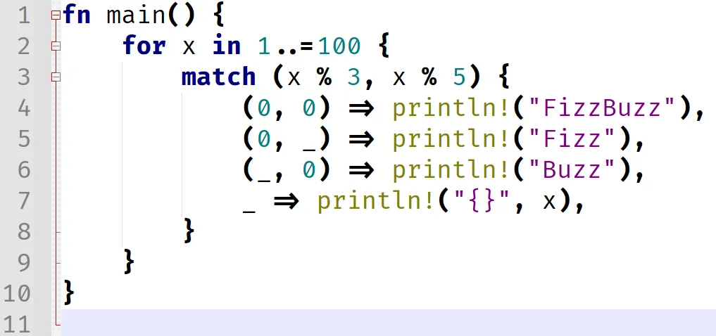
The end result, using the rust fizzbuzz example from earlier is below. The only real differences in this real world example are the => characters,
but you can see all the other ligatures in the linked image above.
Do I like it ?
Well, I think so, but I am still not 100% sure. I think this is one of those ideas that if I had been introducted to a long time ago.
I certainly like it when I read the code, it looks more natural. The only downside is the fact it takes multiple keystrokes to “create”
a ligature, and also multiple keystrokes to destory one. When you have === from javascript for example, it took 3 keystrokes to create it.
However, if you backspace through it, you get a == which is also a ligature, before = which is just a character, before it is finally
fully deleted.
This will take some getting used to, but I currently intend to perceiver.